I can’t really believe it’s been a full week since leaving Disney. Each day that’s passed I’ve become more and more sure I made the right move. Now, I know we’re only a week into it, but it just feels right.
Happily, it’s been an insanely busy week. New clients & projects, sorting out the plan for some killer products, and having the freedom to spend some time with my awesome wife and son during the day. I love it.
One of the large items to strike of my to-do list is to get an identity system worked out for the new company. So, call this a (sort of) announcement that our new design & consulting company is called J. Blackbird LLC. We’re all set up and ready to do business, we just don’t have a face yet. We need all the basics. Yknow… sites, cards, estimates, invoices and all that jazz.
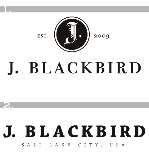
I’ve set to work narrowing down the style we’re going for. Both Janey and I are drawn to old print. Ephemera of many sorts. Trying to take some of the bits of inspiration we find and simply choose a direction is very difficult for me. So I’m asking you. Take a look at these options and let me know what you think in the comments.

Not to sway you at all, but I think we’re both leaning for #1… and to give myself a little breathing room, I’m going to say some variation of #1. Speak up if you’d like…
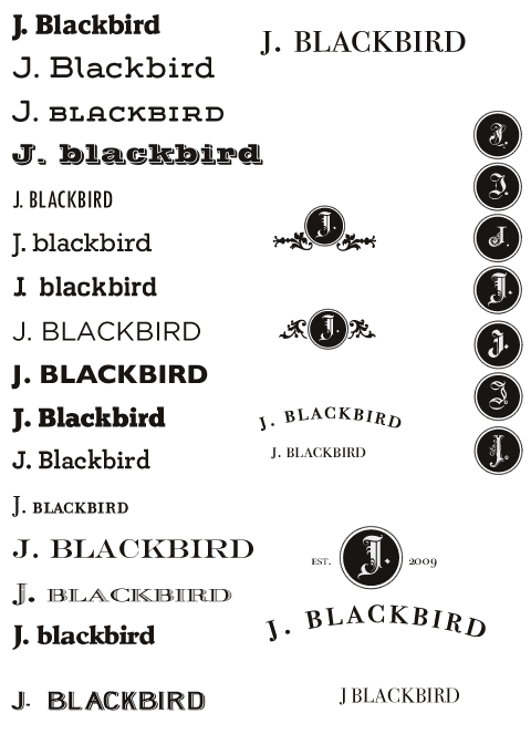
And for your perusal, the scratch sheet I was narrowing from…

I’m leaning towards #1 also, but I think the J in the circle needs to be more distinctive so it doesn’t get mistaken for an I or a T. I’m not sure about most people, but I sometimes have a hard time distinguishing capital letters in old english typography if there’s no context. Obviously if you have J. Blackbird under the logo I can easily see that the letter in the logo is supposed to be a J, but what if you ever use the logo by itself?
Also, I’m not too thrilled with the font of the J. Blackbird underneath the logo there, and it’s hard for me to imagine all of those other fonts in that configuration. I’m also leaning towards not going all-caps.
These are just my opinions so feel free to disregard.
I like some combination of the two. I like the bolder text of #2, as well as the “Salt Lake City, USA” text, but having a “J” icon is pretty cool.
@Mike Berry – Points very well taken, and I certainly won’t disregard 🙂
I’m the same way with old english and other blackletter or gothic faces. Context is always key for me. I’d like to be able to use a smaller mark by itself.
As for the type of the name… I don’t think I’ll ever be completely happy. but this is the one that, when spaced the way I like, offended me the least.
Seriously… I’m the worst client I’ve ever had. So damn indecisive.
@Jeff – I created the second as more of a modern feeling one. I do have to admit, it’s not Janey’s favorite.
In the end I’m still playing, I still imagine I’ll end up with some iteration that looks like #1
You could always create your own font:
http://howto.wired.com/wiki/Create_Your_Own_Font
If you want it done right you’ve gotta do it yourself. Isn’t that what they say.
You’re right about no font being 100% perfect. I’ve always had to settle because I’ve never had the time to create my own font.
I’m a fan of typography myself. Probably not as much as you, but I do enjoy fonts. I used to be a Graphic Communications major in a past life, and I enjoy reading and learning about design. 🙂
Currently working on my own identity — I feel your pain.
Having looked at your scratch sheet I’m thinking option one… with some tweaking.
I’d be looking at a ‘transitional’ typeface set in bold…Baskerville and Mrs Eaves spring to mind. Something with a slightly bracketed serif will hold up better when reduced.
Regarding the old english “J” — I’d pay close attention to the stroke weights and the overall balance. If simplified/less intricate it could make a great wax seal, emboss, deboss, etc.
Have you considered making the framing circle and “j” one element?
Additionally I would tighten up the spacing of J.&BLACKBIRD.
That’s my two bob’s worth.
I like the second one, its more intriguing than the first. You leave a lot more to imagination. I feel like with the first you’re following more identity trends than the second.
Both are beautiful though.
Frankly, they’re all pretty good options. I’m wondering where you found such a great group of fonts. Have you acquired them piecemeal, from multiple sources, over the years? Or do they come from a single source?
Thanks all for the comments… I did end up going with a variation of the second option (you can see it on our new site that’s being designed in the open… each stage is getting feedback from twitter http://jblackbird.com ). I designed a little compass rose to pair with J. Blackbird. This does have some significance to my wife and I… but I’ll leave that to a later post.
@Greg – I’m what’s known in most circles as a hoarder 🙂 So over the years I’ve acquired a stupidly large collection of fonts. Some are freebies, some are given as projects dictate, others I buy. I’m a closet type nerd, so I can never have enough.