Something fun about peeking in on this guy making his way around to all the toys. love it.
A Designer’s Portfolio, 16th Century-Style
A Designer’s Portfolio, 16th Century-Style
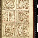
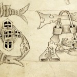
These pages are from the Macclesfield Alphabet Book, essentially a 16th century design studio’s marketing portfolio. The British Library is hoping to buy the book from its current owner, at a price of £600,000.
From the CR Blog:
Produced c1500, the book is filled with designs for different styles of script, letters, initials and decorative borders. All are believed to have come from one workshop, where the book would have been used not just in ye olde pitche meetinge but also to teach assistants how to reproduce the house styles.
(via Boing Boing)
Movie Title Screens
Recreating the button
Recreating the button
A really great write-up by Douglas Bowman about the thought and process he’s putting in to reinvent browser button controls at Google.
10 Things a web designer would never tell you
10 things a web designer would never tell you
Paul Boag tells it how it is. Don’t let those damn pixel pushers take control.
To return soon
Perhaps it was a mistake to launch a new site (with a blog) just before leaving town for a little side project. I haven’t had many free moments to write a proper blog post.
Rest assured, new readers, I’ll be back to a normal schedule soon that’ll lend itself much better to writing about wonderful things both online and off.
Thanks for hanging in there.
A Simple Act of Faith
A Simple Act of Faith
Buy ten shares of stock in an american company today.
A simple & beautiful call to action.
(From Coudal)
Meetings Are a Matter of Precious Time – NYTimes.com
Magic in pieces (of type)
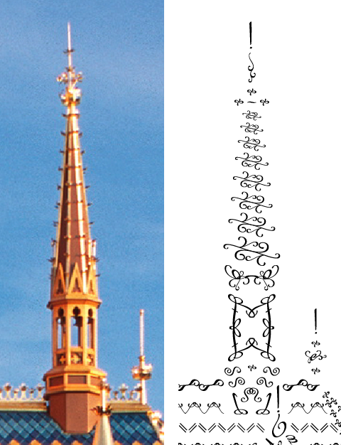 When I set out to create my type castle, I didn’t realize how much fun it would be to find interesting ways to approximate some of the finer bits of detail on Sleeping Beauty Castle. I’m not going to say I did everything the right way… and each time I open it up I find little bits to tweak before going to press, but things shaped up real nice & I’m quite happy with the result.
I thought it might be fun to use a few close up pictures to illustrate some of the detail. You can click on any of them for a larger view.
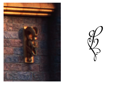
The first (Top right of this post) is an unique spire on the castle. One of the interesting points is the pattern the shingles make on the roofline where this spire appears. There is another interesting, but very different shingle pattern on the opposide side of the castle as well.
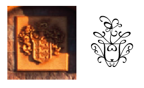
There’s also some fun little details that probably won’t get much attention. This is the Disney crest, that is displayed above the drawbridge, and some cute squirrel gargoyles to the left and right.
Mad Libs style forms
In the short while since this site launched, I’ve had basically two kinds of email. The first is the kind I was secretly hoping for, expressing interest in my Magic in Type project. But the second caught me totally by surprise. I’ve actually had several people ask how I created that “Mad Libs” style fill-in-the-blank contact form.
It’s such a simple little thing but it seems to have struck a chord with several website visitors. It feels a little strange to write a whole post about it (as it’s not in any way groundbreaking)… but enough people have inquired, that I thought it might be nice to write up the process.
[Read more…]
